Neutral colour
Light colours to convey luminosity and a purity associated with healthcare.
Light creates ambience and feel of a place, as well as the expression of a structure.Le Corbusier - Architect
Pure and simple
Colour is intimately linked to psychological stimuli. It conveys information by differentiating elements and accentuating contrast, and has an inherent symbolic significance in communication. A specific colour scheme is used to express meaning and a basic philosophy.
Clean
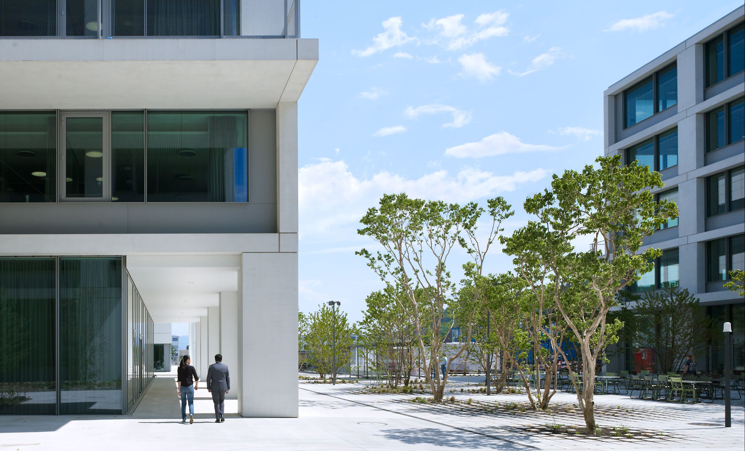
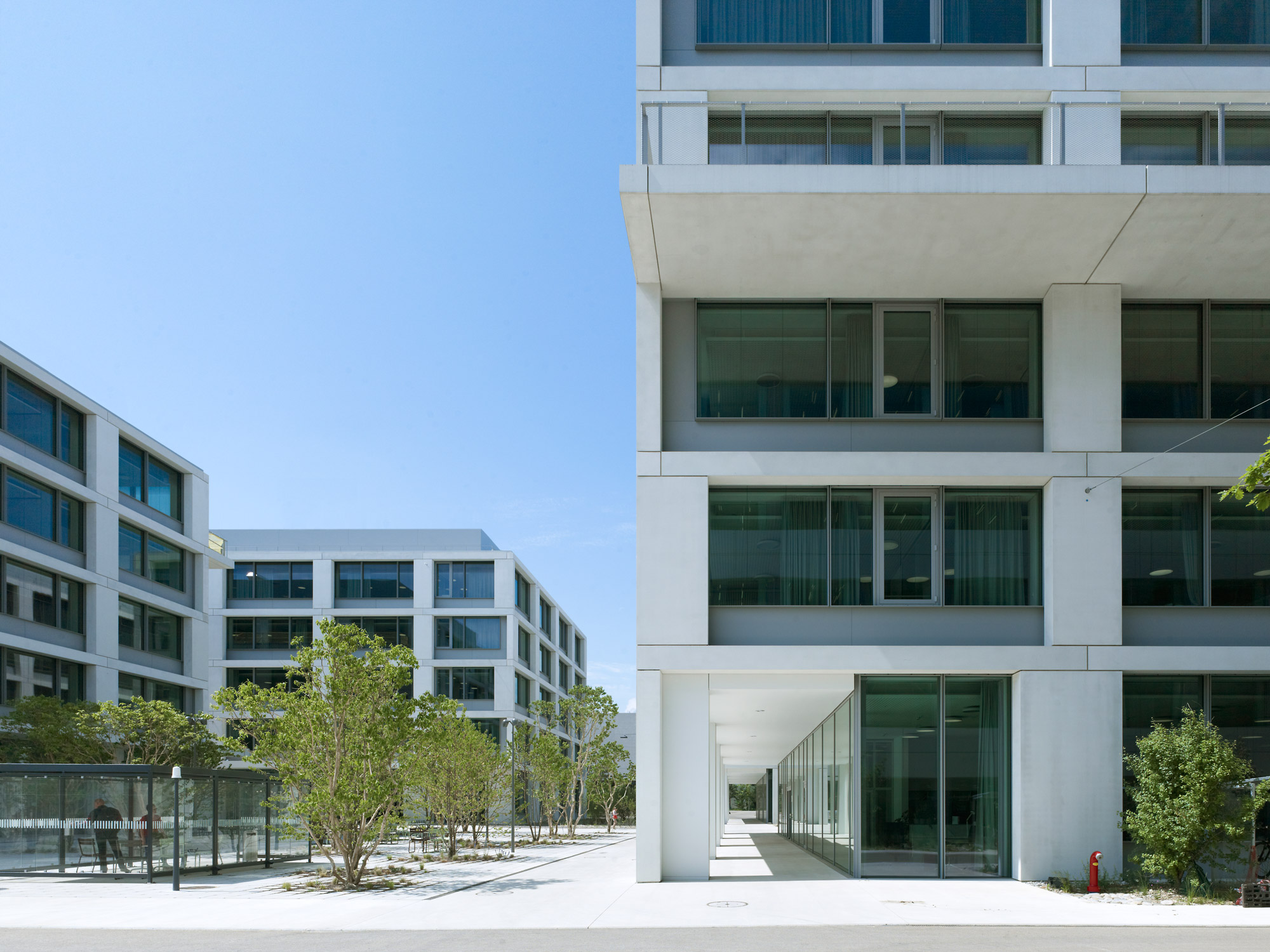
White and light grey enhance the clarity of the architectural form and set the stage for the discreet coloring of elements. They are the preferred colour tones as they communicate the image of cleanliness, a paradigm for a healthcare company.
Representative
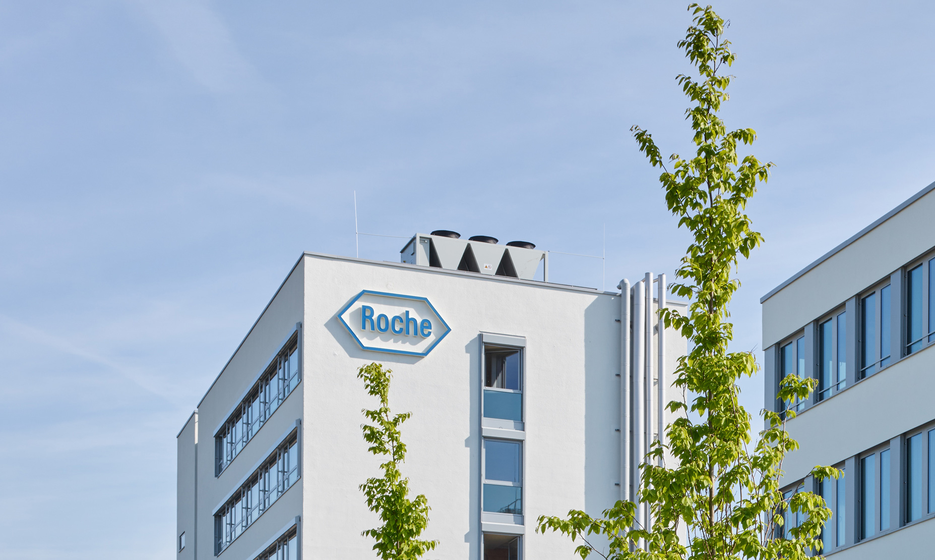
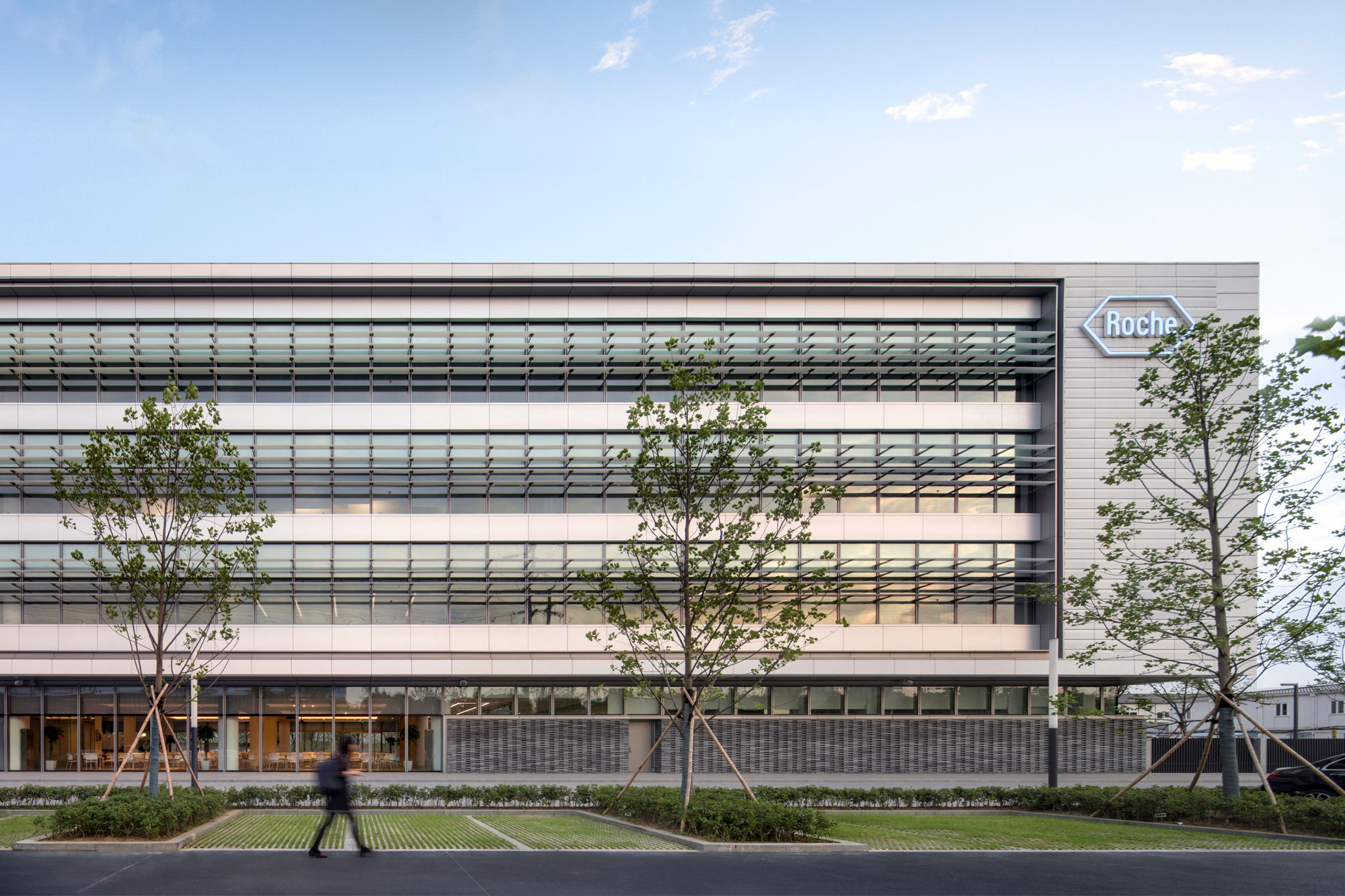
Blue, the colour of the logo, stands out effectively against white surfaces. Do not use the blue in building elements. Refer to standard colours listed in the Roche Brand
The exterior of Roche buildings is of neutral colour, mainly white or grey, to convey a refined simplicity. Buildings with light facades, expressing clarity of architectural form and plasticity with natural light and shadows. Other colours should only be used as accents and, whenever possible, on non-permanent finishes. Never use polychrome graphics as ornamentation on facades.
Key to Neutral colour
- Roche buildings convey luminosity and a purity associated with healthcare.
- White and light colours are preferred for buildings.
- Accent colours shall be used mostly on non-permanent finishes.
- Roche blue is only used for the logo, not for building elements, graphics or decorative elements.