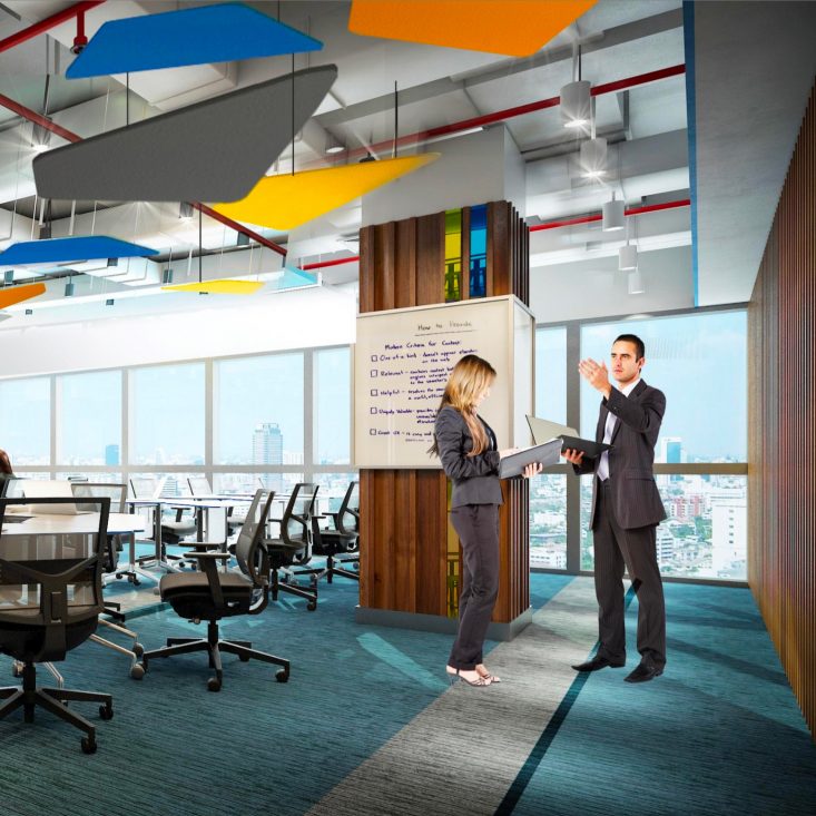
Inspiring colours
An optimist creative environment that influences our emotions and behaviours.
Choosing colours shouldn't be a guessing game, but instead a conscious decision. Colours have meaning and function.Verner Panton - Designer
Colour tone-in-tone
Colour has a psychological influence on people. Choose a natural and elegant colour palette to effectively generate a feeling of balance and harmony. Working from a single base colour, experiment with a variety of shades, tints, and tones of the same colour. Use contrast to create at least one darker shade and one lighter tint of the original colour. Roche interiors are not only blue, white, and grey; there are no such Roche colours for interior spaces, but they should be used in a specific way, with a logic behind to produce a coherent and cohesive sense of place.
Combine shades of one same colours to create a subtle contrast that makes spaces richer.
Choose a colour palette of muted, non-saturated colours to add warmth to a space.
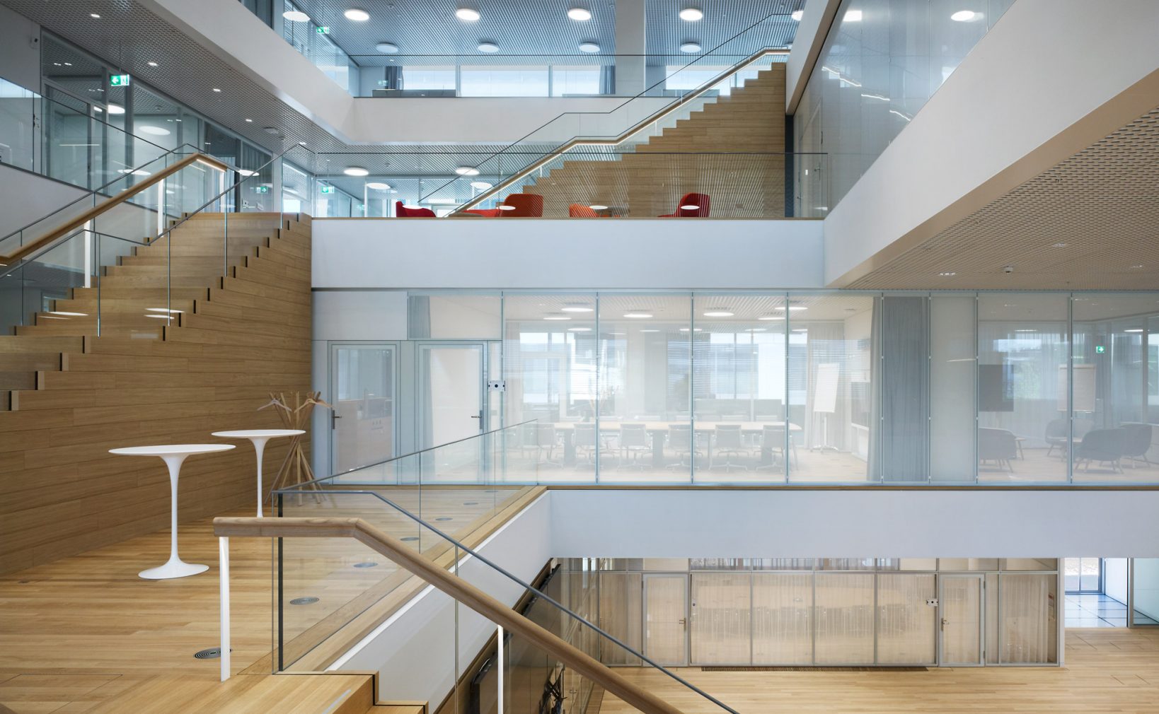
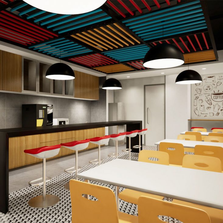
Colour concept
An overarching materiality and colour concept shall be developed, this shall relate to the functional characteristics of the spaces, distinctive typologies which should be differentiated with the atmosphere of the spaces. Think of the character of a space when choosing colour. Select different colours to create different ambiences. For instance, warm colours bring comfort and an invigorating brightness to a room, whereas cool colours create a relaxing and restful space. Choose one or the other in accordance with the use of the space. Once it is decided whether the room will be active or passive, choose a main neutral colour, then a secondary colour, and finally some accents. Do not distribute the colours equally. Subtle differences in tone create great depth and richness. The overall resulting colour scheme should follow a clear logic for the applications of the colour palette. Often the chosen reference colour palette has been extracted from the natural or cultural context according the the Site Master plan guidelines, this evokes a familiar environment that brings comfort.
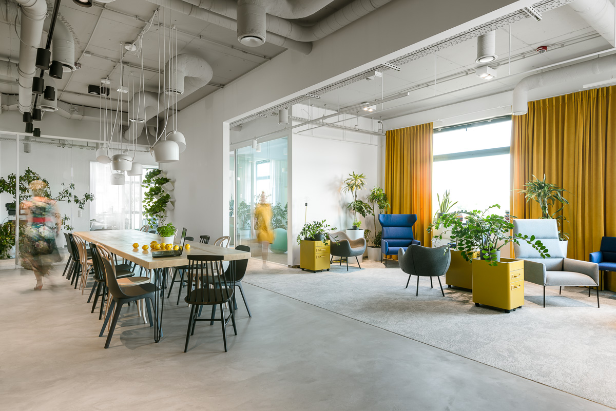
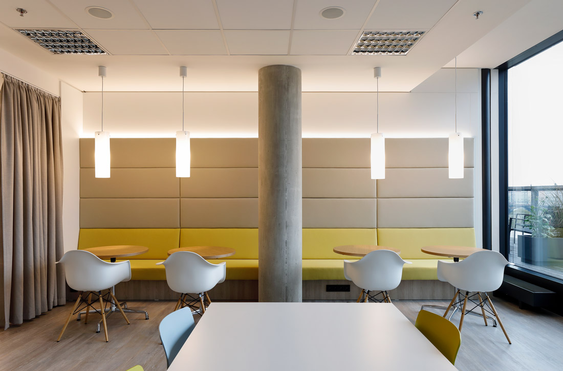
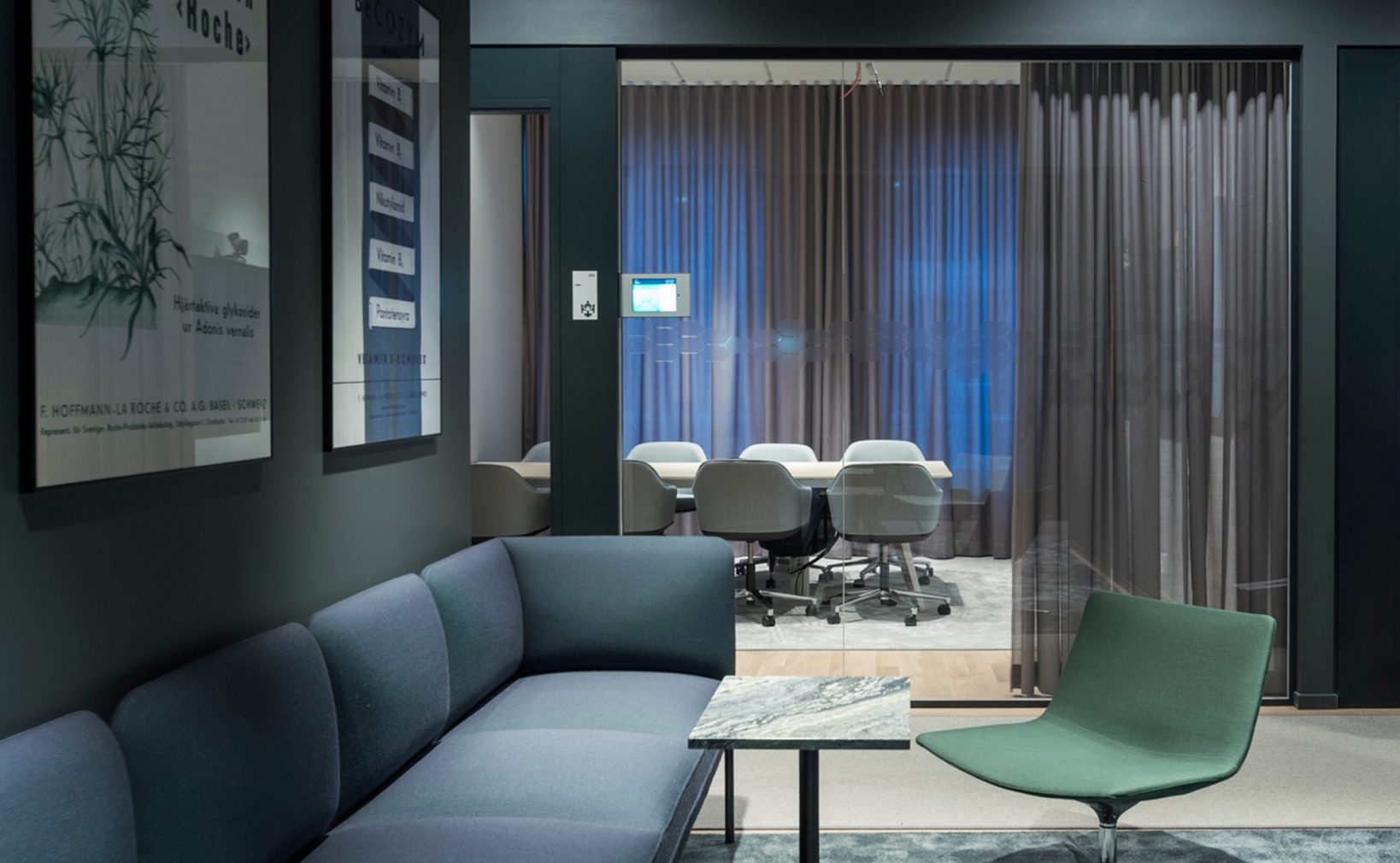
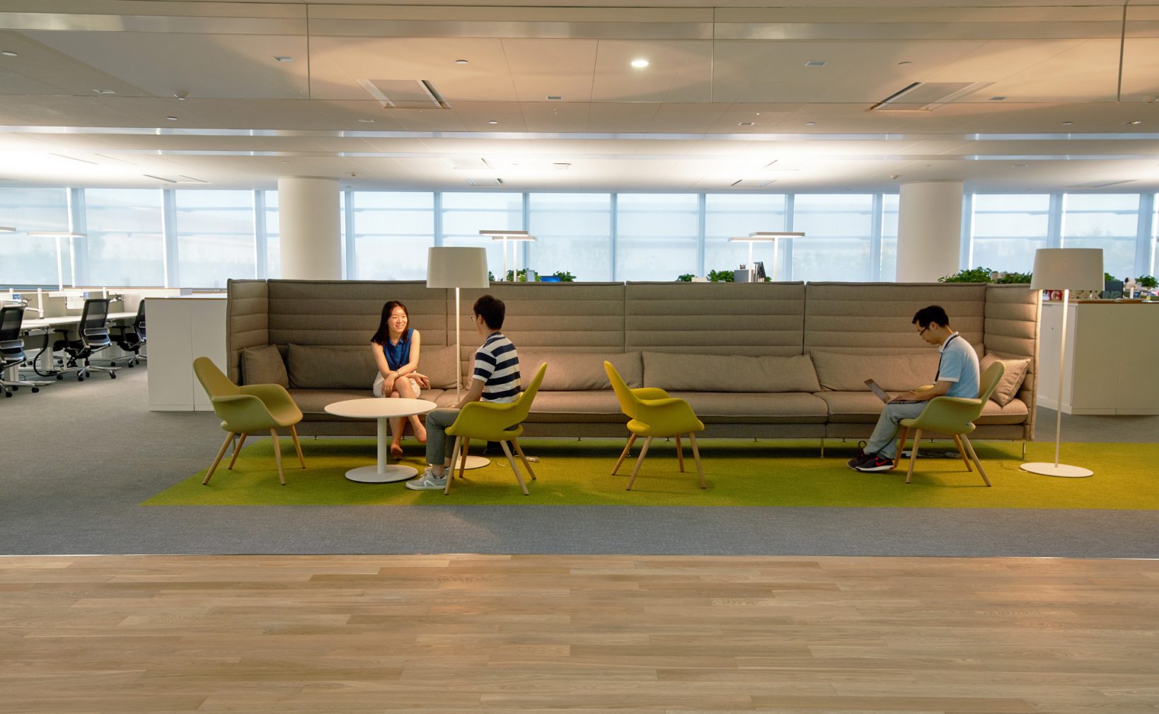
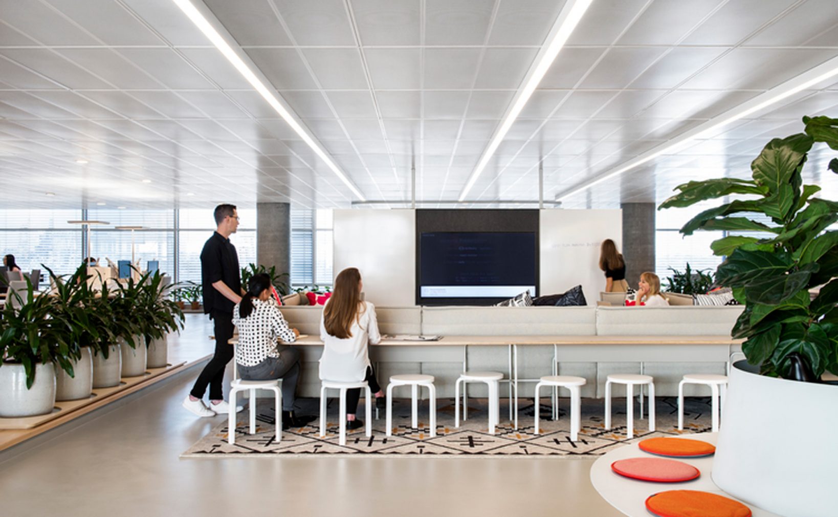
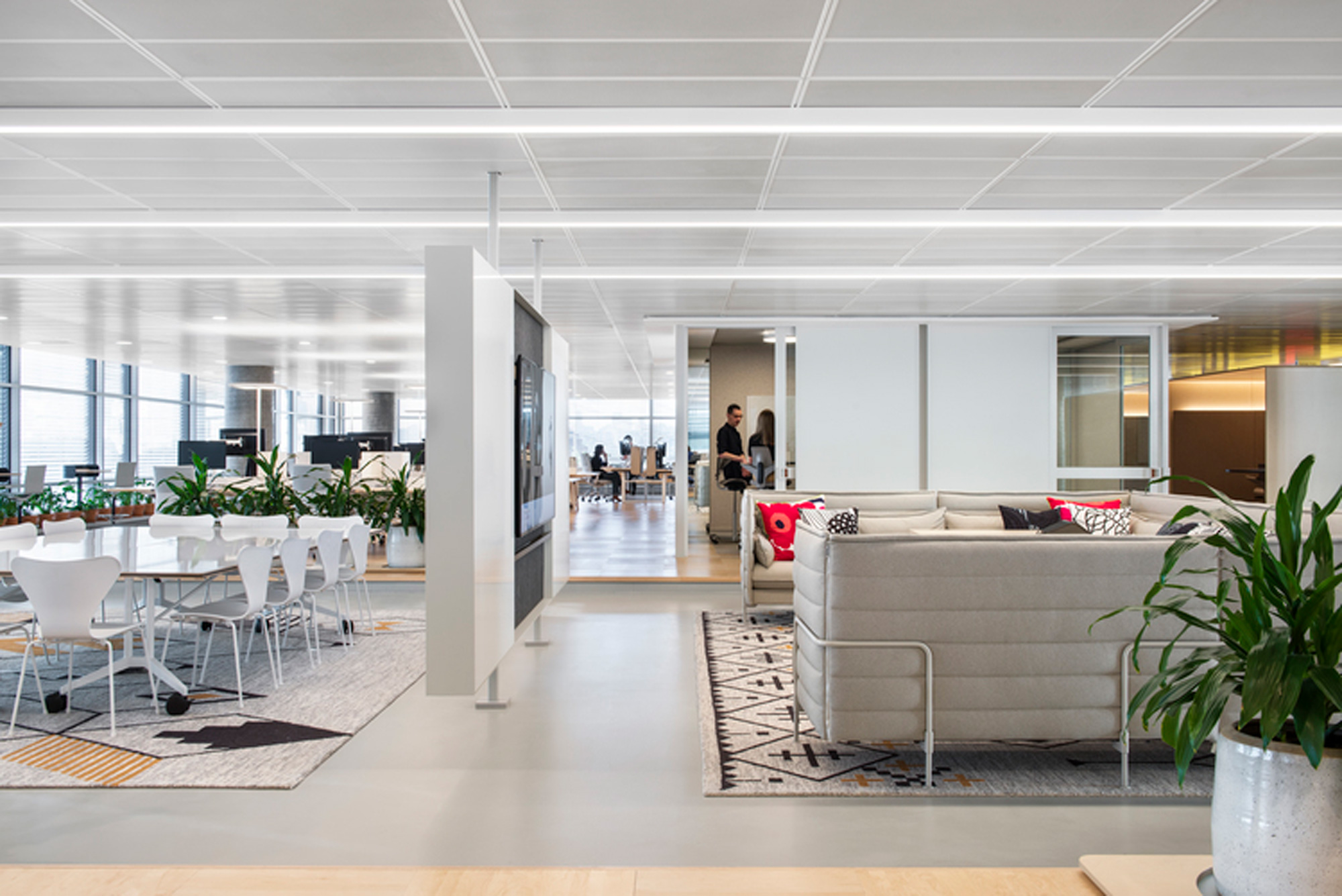
Dominant colour
Used in about 60% of the area.Choose a neutral main colour that brings a light and clean appearance such as white, light beige, light grey, etc. to ease concentration and induce tranquillity.
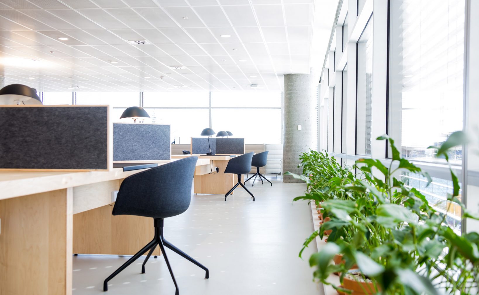
Secondary colour
Used in about 30% of the area. Select a second colour to balance out the palette. Combined with the main colour, tone-on-tone, with no high contrast between them. It can come from a natural material, like wood or concrete, for example.
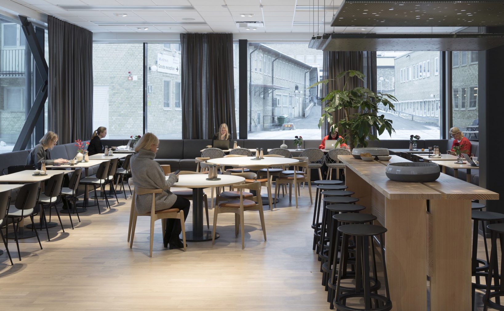

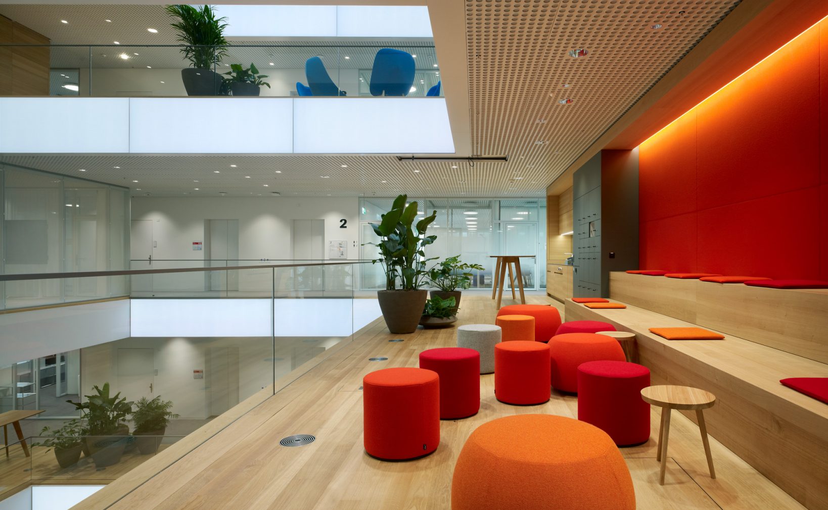
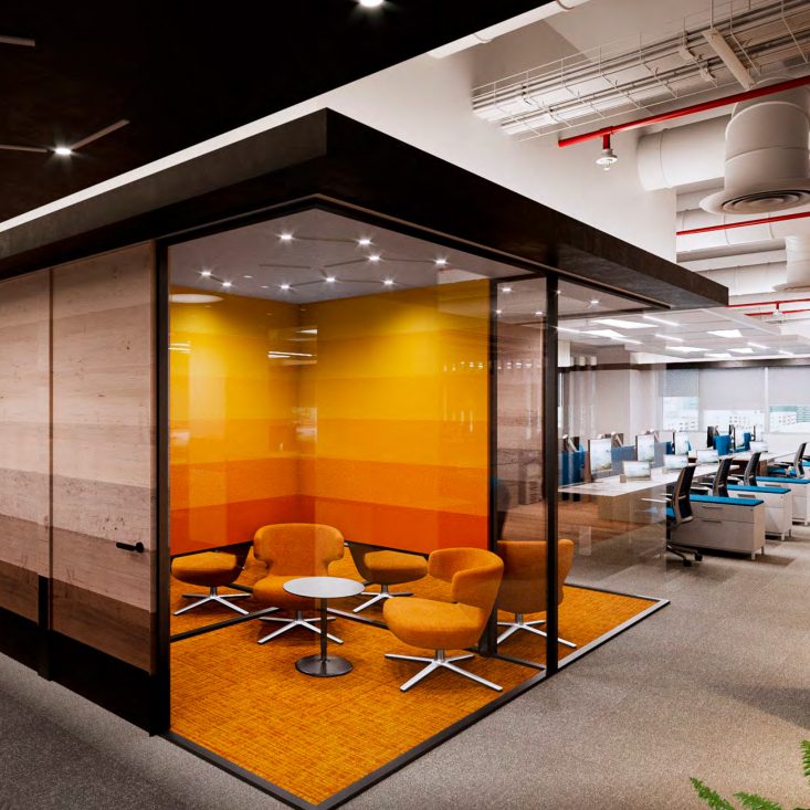
Accent colour
Used in less than 10% of the area. Do not use more than three accent colours.. Choose mood-enhancing tones in the more relaxed areas. Use accent colours in furniture in small doses to create vibrancy and a delicate contrast. Fabrics on furniture and acoustic walls are a good opportunity to present colour. Woven, two-tone fabrics create more depth. Do not mix many colours within one space.
Prints
Use simplified prints in serene colours that pair well with other subdued colours. Serenity is about creating an environment to disconnect and recharge.
- A coherent and controlled use of prints within the colour palette can help to contextualize a space.
- All prints should be reviewed and approved by Roche.
Don’t
-
Avoid many different contrasted colours wihtin one space.
-
Avoid bold saturated colours used in a playful decorative way.
-
Avoid colour effects and pattern over large areas on walls.
Key to Inspiring colours
- Use of colours should follow a clear concept directly related to the character of the space.
- Colours captured from local context evoke a familiar environment that brings comfort, follow the Site Mater plan for local guidelines.
- Choose neutral, warm predominant palette, with a reduced number of accent colours in complementing tones.
- Avoid many high contrasts and strong colours; avoid dark colours in open work space.